Climate Change - The last 2,000 years of global temperatures
Average global temperature is now higher than it has been for a long time.
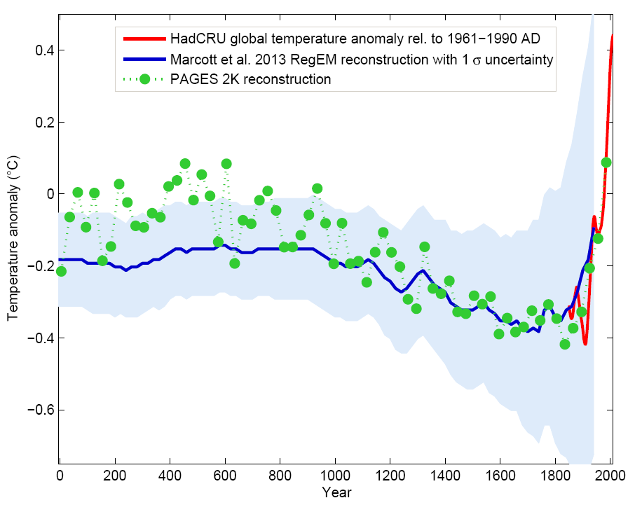
Graph by Klaus Bitterman.
Green dots show the 30-year average of the PAGES 2k reconstruction.
The red curve shows the global mean temperature, based on HadCRUT4 data from 1850 onwards.
In blue is the original "hockey stick" from a paper by Mann, Bradley and Hughes (1999) with its uncertainty range (light blue).
The green dots are calculated using data from many places around the world, using information from a range of temperature proxies, such as documents, ice, lakes, pollen, tree rings, corals, seabeds and speleothems.
PAGES is the Past Global Changes programme launched in 1991.


